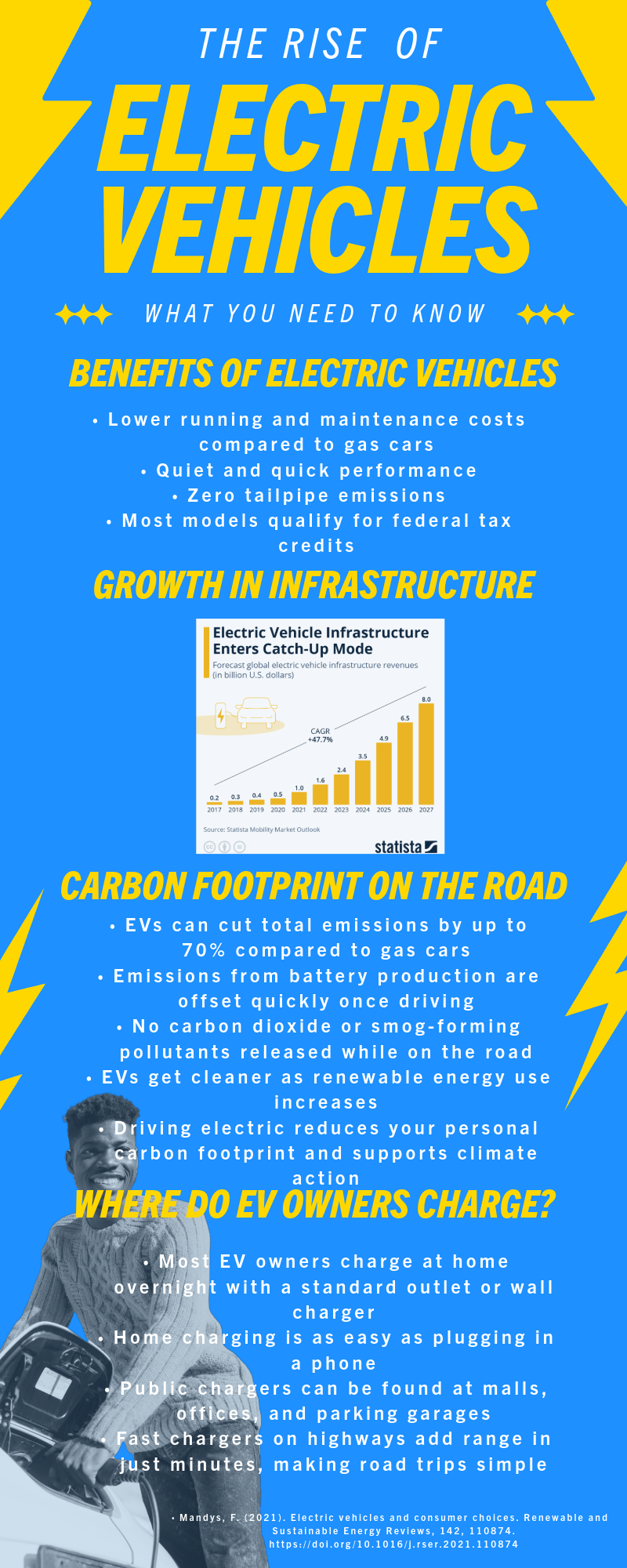
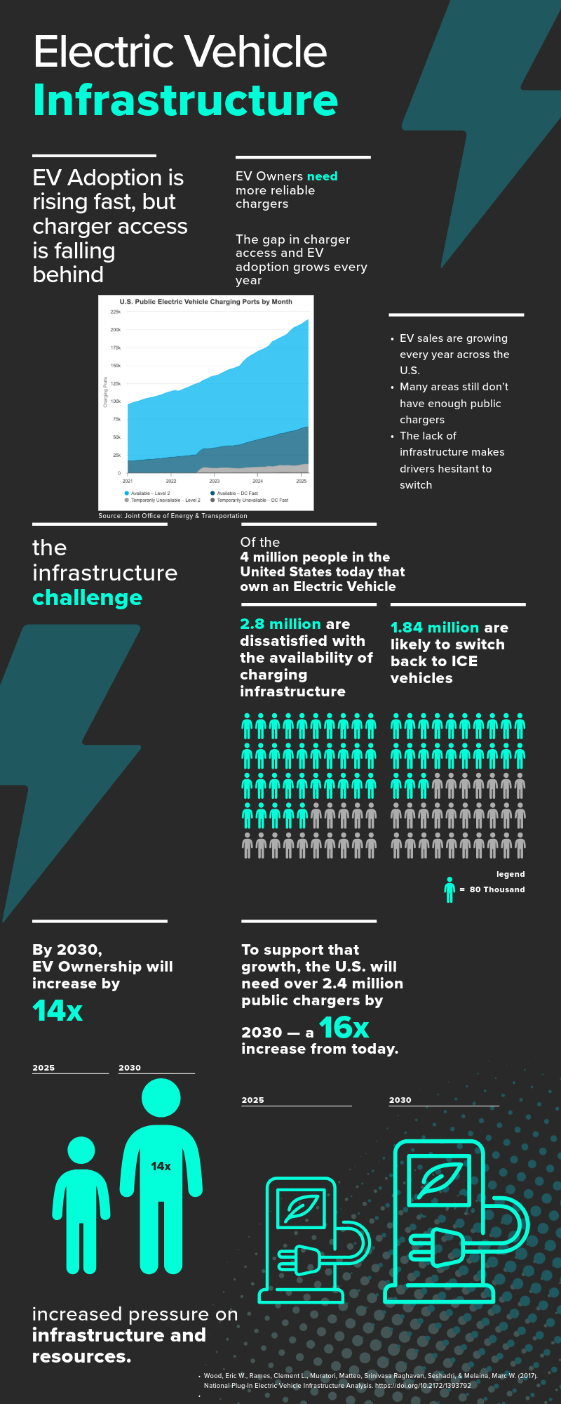
These two infographics were designed to present key information about electric vehicles (EVs) to different audiences. One focused on consumers and explained the benefits of owning an EV, like lower emissions, tax credits, and convenient home charging. The other targeted policymakers and highlighted infrastructure issues, including the need for more public chargers and the growing gap between EV adoption and charger availability. I made these infographics using research-based statistics and visual design principles to communicate ideas clearly and quickly. I also revised both based on peer feedback, such as changing paragraph blocks into bullet points and improving spacing to make them easier to read.
These infographics show that I can translate research into visuals that match specific audiences. They reflect my ability to simplify complex data and use design choices to guide attention and understanding. I also learned how to make information accessible without losing important detail. Creating these helped me practice visual communication, something that is useful in both academic and professional settings where clear messaging matters.